Problem
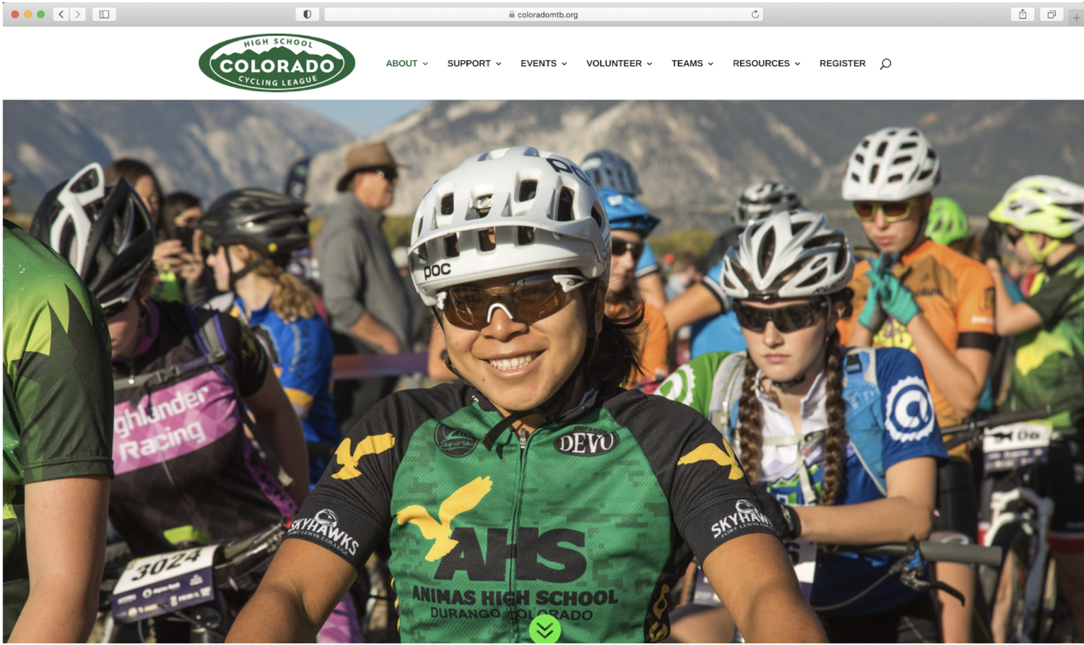
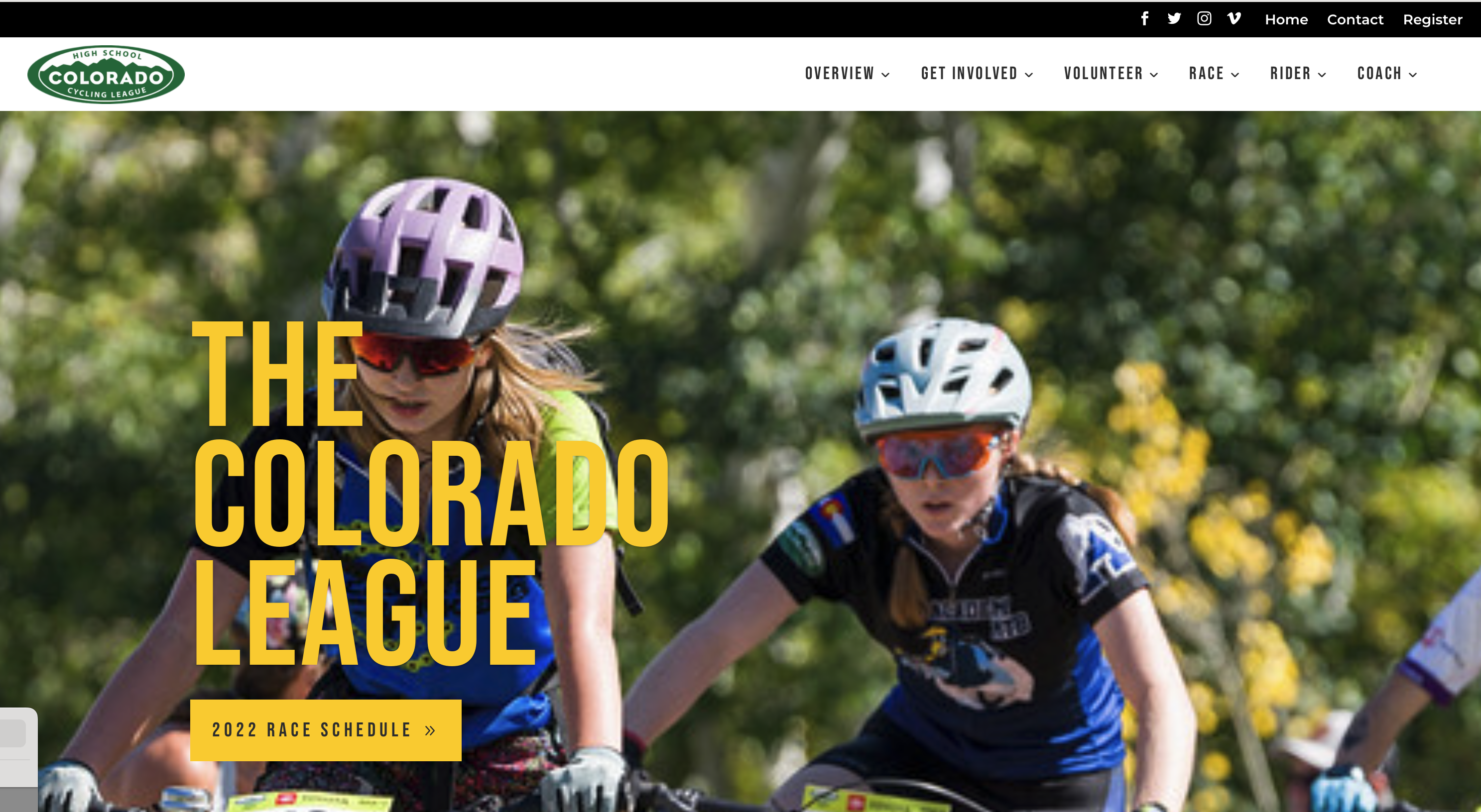
People using the Colorado High School Mountain Bike League website had a hard time finding the information they needed.
Before:

After:

Process
Role
I was one member of a team of four UX researchers. I conducted preliminary interviews with the product owner, a content audit of the site, and ran and analyzed the card sort activity.
Hypothesis development
We conducted an initial interview with the League’s director and web designer. Through this we determined the primary users of the site were coaches, parents and riders. The director and designer believed the primary issue for users was finding information they needed to successfully participate in the league.
Other team members conducted structured interviews with users to learn more about how they typically used the site and what their main goals were when using the site.
These interviews confirmed that users were having difficulty accessing information, that the site was challenging to use on mobile, and that users most often were looking for information related to upcoming races.
User definition
Coaches and parents whose children are members of the Colorado HS MTB League.
- Coaches use the league website for resources, forms and training materials.
- Parents and riders use the league website to access race information and results and access and fill out necessary forms.
Content audit
My team audited the site content to understand the set of information that existed on the site. We grouped similar content together to allow for a smaller number of categories for the card sort.
Survey and card sort
We initially planned to do an open card sort, but the product owner preferred a hybrid option. We conducted a survey and hybrid card sort with 31 options. This was sent to 141 coaches, parents and riders on the League’s email list. Of this group, 83 completed the exercise and survey questions.
Data analysis & report
Based on card sort and survey results, we made the following recommendations:
I. Update the main menu structure to match the recommendations from the card sort. Coaches and parents currently affiliated with the organization find it difficult to navigate the website because there is a lot of content and it is not organized in a way that fits their mental models.
Recommended top-level menu structure:
- Race Day
- Coach Resources
- Rider Resources
- Support the League
- League Overview
II. Add a race day menu to your top level navigation to enable users to quickly access this content. The primary use case for the site is accessing race information, so this solves the problem of users being unable to find this information.
III. Reformat visuals so that they are smaller but will drive user interaction on the website. Users have to scroll for too long to find vital information on the site.
IV. Prioritize content for specific channels and consider removing some website content that is infrequently accessed or could be shared via other channels such as the newsletter or social media. Use Google Analytics to support in identifying infrequently accessed content.
Problem
An agency needed a newsletter refresh. They lacked a content strategy and a consistent publication approach.
Process
Role
I conducted the research and developed and implemented strategy for this newsletter.
Persona development
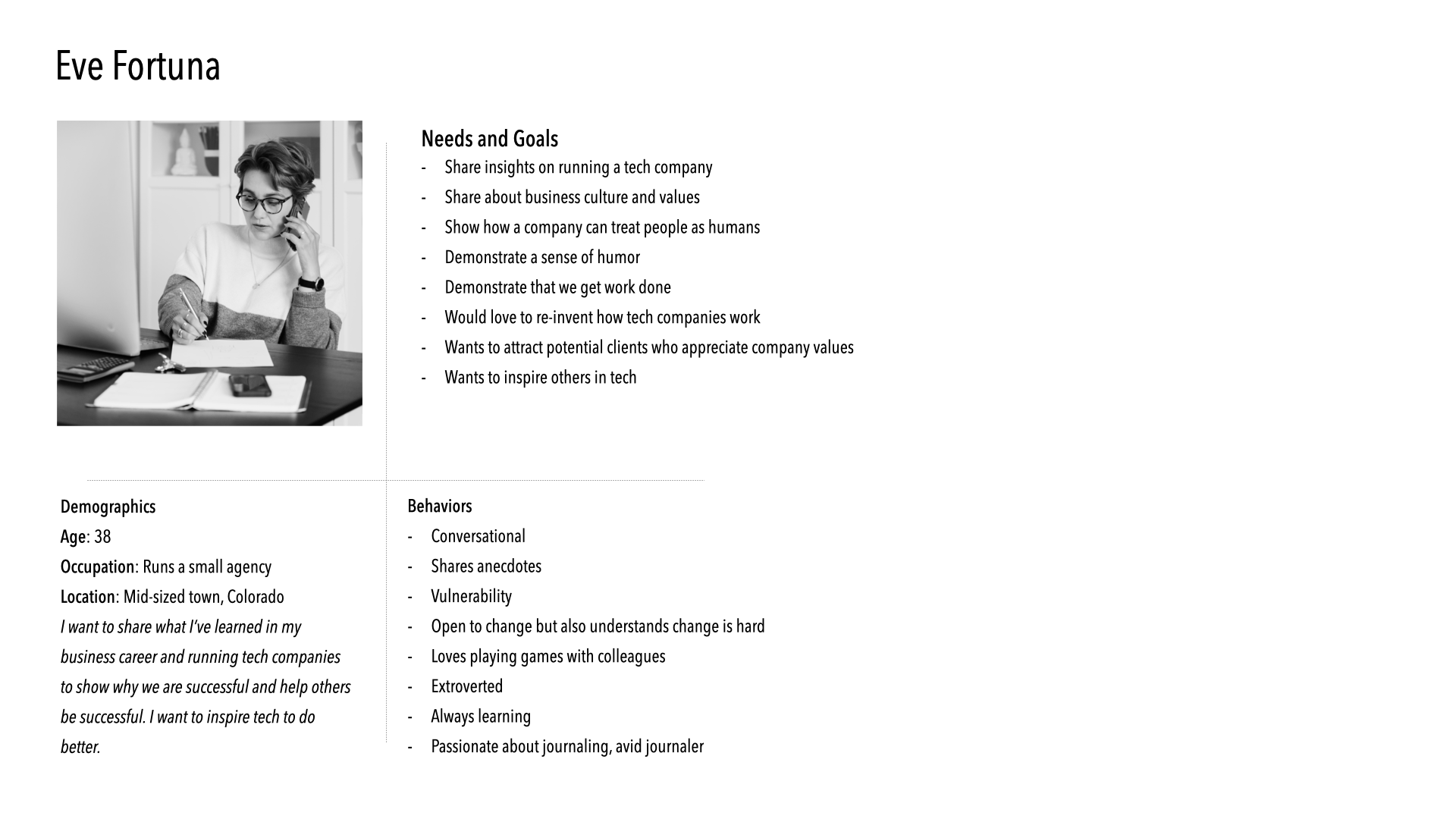
First, I developed a persona for the agency. This discovery process helped establish how the newsletter would sound and what topics were important for the newsletter to cover.
Agency Persona

Competitive analysis
I analyzed several existing email newsletters from companies in similar spaces. We liked other newsletters that had:
- A text-based structure, like a letter that arrives in your inbox.
- Regular links in topical areas relevant to the agency’s personality or mission.
Style guide
We wanted the newsletter to feel like a weekly conversation from the agency that subscribers are “in” on. We also wanted subscribers to know that the agency was interested in their growth as well as its own, so we wated to share ways to improve their companies and themselves. With input from other stakeholders, I created the following style guide:
- Written in a letter-type format, with a salutation of “Hi Friends” or something similar.
- Signed by the author for that week.
- Often includes an anecdote from a workday at the agency, or a story about something that happened at the agency. This anecdote often broadens out to discuss agency culture, management culture, or tech culture.
- Displays the humanity and fallibility of the agency.
- Is positive without bragging.
- Often discusses Hard Things or situations that helped the agency grow.
- Partners with a local business development consultant to include weekly journaling prompts, encouraging reflection and growth.
Implementation
I implemented a weekly content strategy process that involved sessions to brainstorm new topics, a writing session, an editing session, and a review process to catch any issues and get feedback.
My writing partner and I also crafted evergreen newsletters and documented a replicable publishing process to handle unexpected absences.
